Portfolio 2026

01

KeyBank logo

KeyBank KBBO+

AI insights and a comprehensive redesign of the Key Business Banking Online (KBBO) platform.

KeyBank KBBO+ project design

Role

One of Two Designers

Timeline

Jun 2026 - Aug 2026 (2 months)

Tools

Figma, FigJam, FullStory, Curinos, UserTesting, UserZoom, Pencil + Paper

Background

The KeyBank Business Banking Online (KBBO) platform serves KeyBank’s small business clients. KBBO is integrating AI-powered insights (through Personetics, a third-party integration) to deliver more personalized, actionable dashboard experiences.

This project was conducted as part of an internship with KeyBank to kick off KBBO+, a larger-scale improvement upon KBBO’s platform.

Overview

Problem

1. Lacks a comprehensive financial health view.

2. Limited personalization of the banking experience.

3. UI lags behind leading fintech competitors.

User Goals

1. Transfer money, access support, and receive information quickly and reliably.

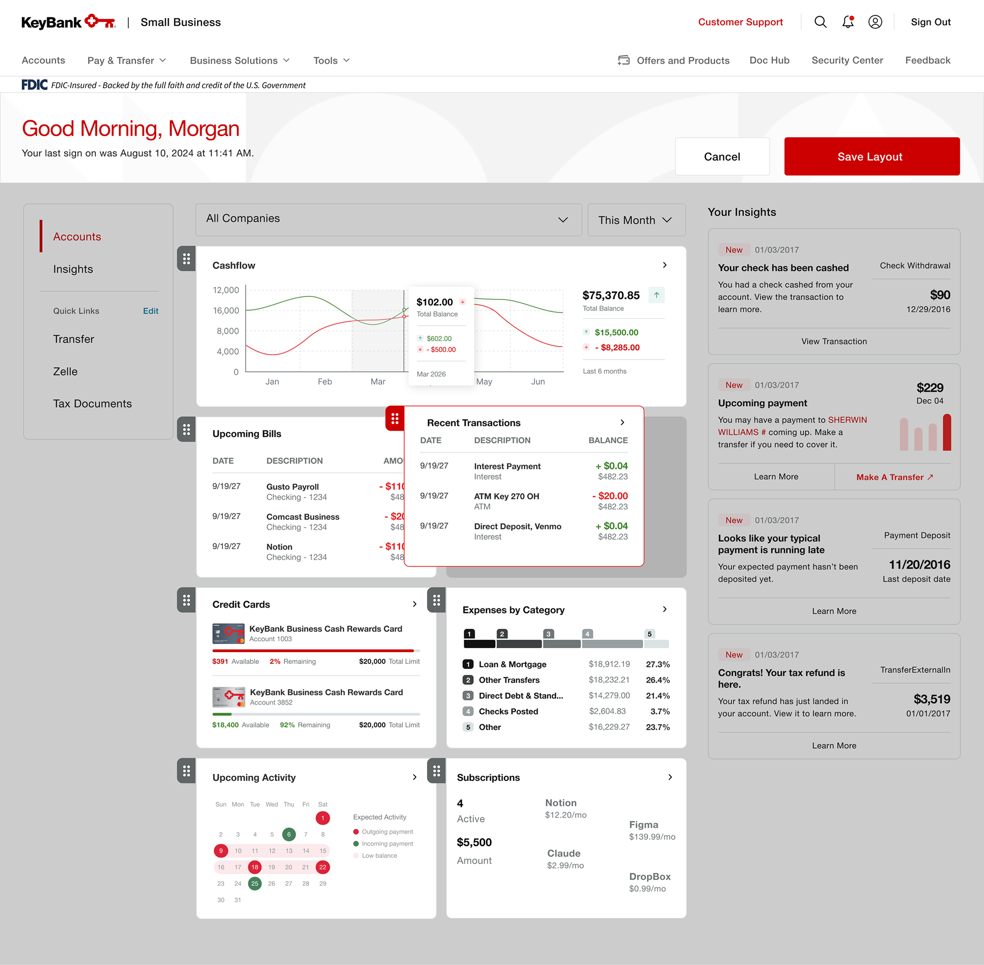
2. Customize dashboard layouts.

3. View detailed analytics of accounts.

Limitations

• Due to business-specific Personetics widgets being not yet available, we had to rely on taking cards from retail banking and reworking blue-sky versions to tailor to business owners.

• Since UserTesting and UserZoom had not yet been integrated into one platform, we were unable to conduct heat map click tests on our main study, and had to rely on written response tasks to evaluate findability of information.

Results

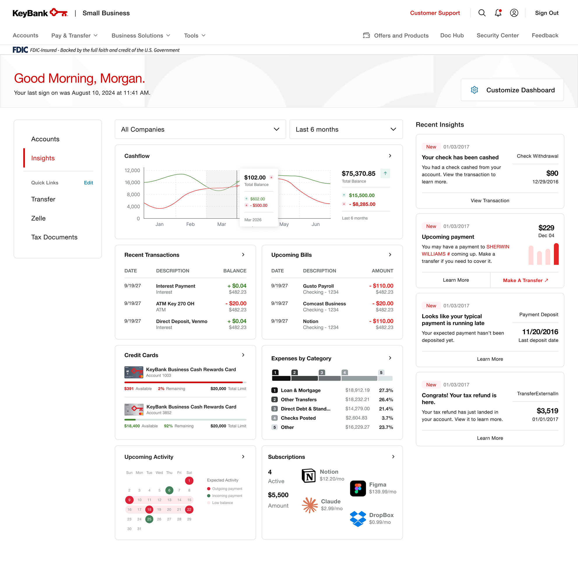
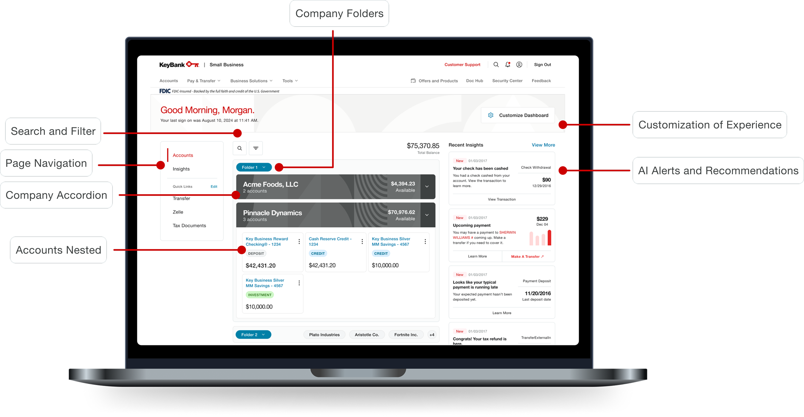
1. Integrated AI-powered insight widgets and data visualizations of advanced analytics, customization of insight widget and accounts layout, financial alerts and notifications, and improved scalability of account summary dashboard.

2. Achieved a 92.52% task success rate across 7 findability and navigation tasks in unmoderated UserTesting studies with 19 participants, along with a SUPRQ score of 4.29, which sits around the 88th percentile in comparison to a benchmark of hundreds of other digital experiences.

Research

Target Audience

Business owners of the KBBO platform.

Research Methods

Competitor Analysis

To identify gaps between competitor business banking platforms, I analyzed data from Curinos to view each platform in the authenticated space.
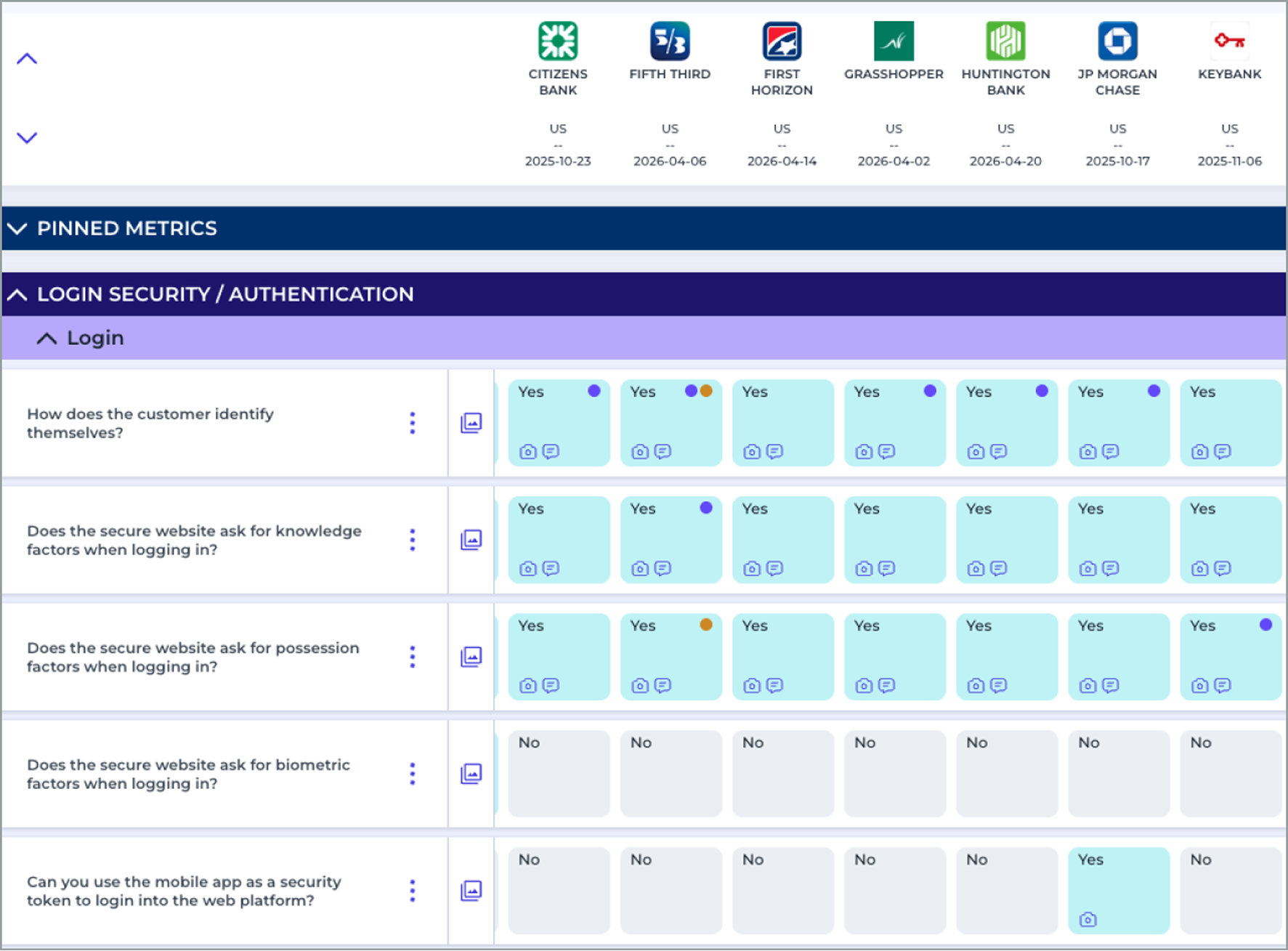
Curinos comparison of business banking platform features

Market Research

To understand small business owners’ experiences with different banks, I combed through forums such as Reddit and Quora. I also utilized Gemini to create a comprehensive overview of existing market research.

Gemini, Reddit, and Quora research sources
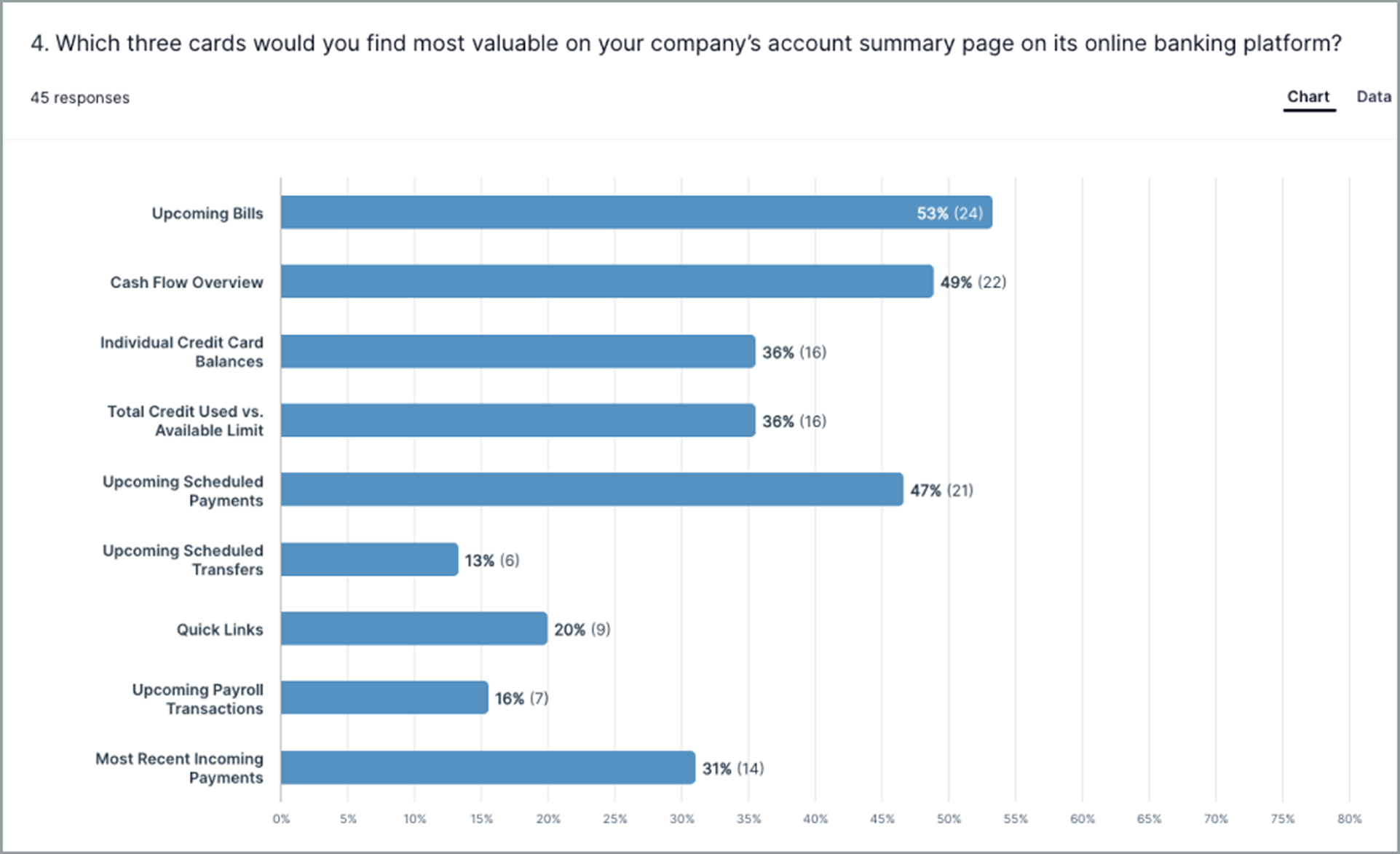
Previous UserZoom survey results

Previous Research

  • User Interviews with KeyBank business owners
  • UserZoom studies testing prototypes
  • UserZoom surveys
  • FullStory analytics from KBBO Users
  • Personas representing businesses of different revenues

Key Findings

  • Users expect speed and reliability.“Opening the account took me less than 10 minutes” (Reddit).
  • Users are frustrated by lack of information transparency.“Don’t go with Chase. [They’ll] find every way to screw you on fees” (Reddit).
  • Users expect quick and clear routes to receiving support.“24 hour customer service is one thing that is invaluable the few times you need it” (Quora).
  • Users expect intuitive money movement.“Traditional banks are great until you actually need flexibility on moving your money” (Reddit).
  • Users want to be able to customize their dashboards.93% of survey respondents indicated at least some interest in being able to customize the dashboard (UserZoom).

Prioritization of Insight Elements

  • Must-Haves
    • Cash flow overview
    • Upcoming bills and recent transactions
    • Customization of dashboard
    • Expanded analytics
  • Important-Haves
    • Spending insights and categories
    • Credit card balances
    • Easy access to customer service
  • Nice-to-Haves
    • Projected future analytics
    • Financial recommendations
    • Easily definable terminology

Design Process

Account Summary – Lo-Fi Iterations

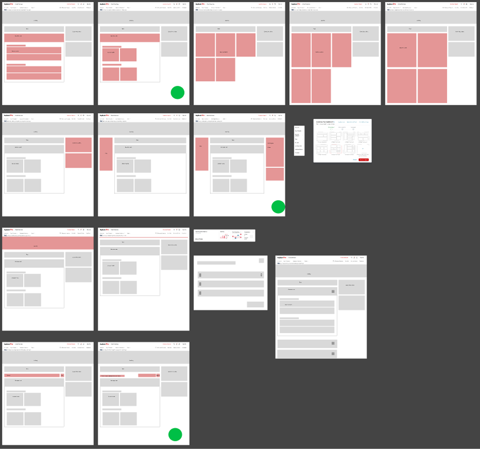
KeyBank account summary low-fidelity iterationsKeyBank account summary low-fidelity design board

Account Summary – Hi-Fi Iterations

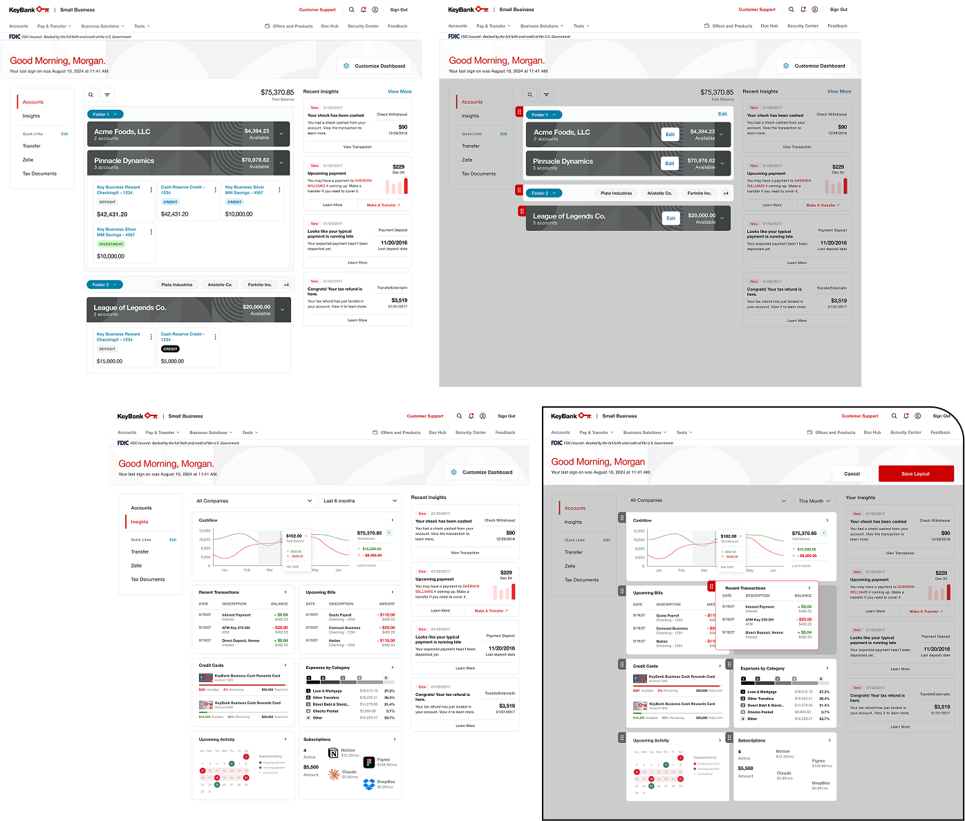
KeyBank account summary high-fidelity iteration one
KeyBank account summary high-fidelity iteration twoKeyBank account summary high-fidelity iteration threeKeyBank account summary high-fidelity iteration four

Insights – Lo-Fi Iterations

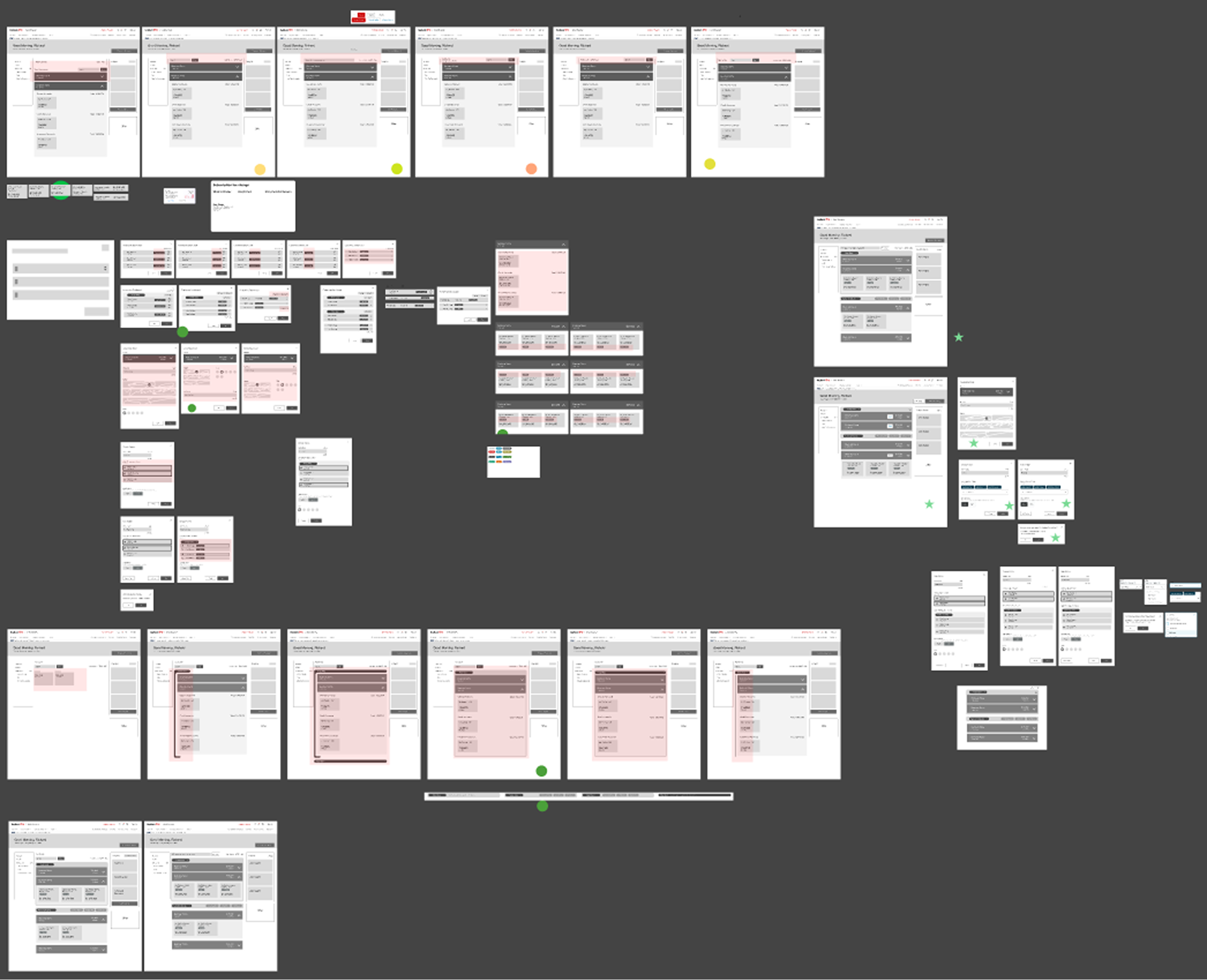
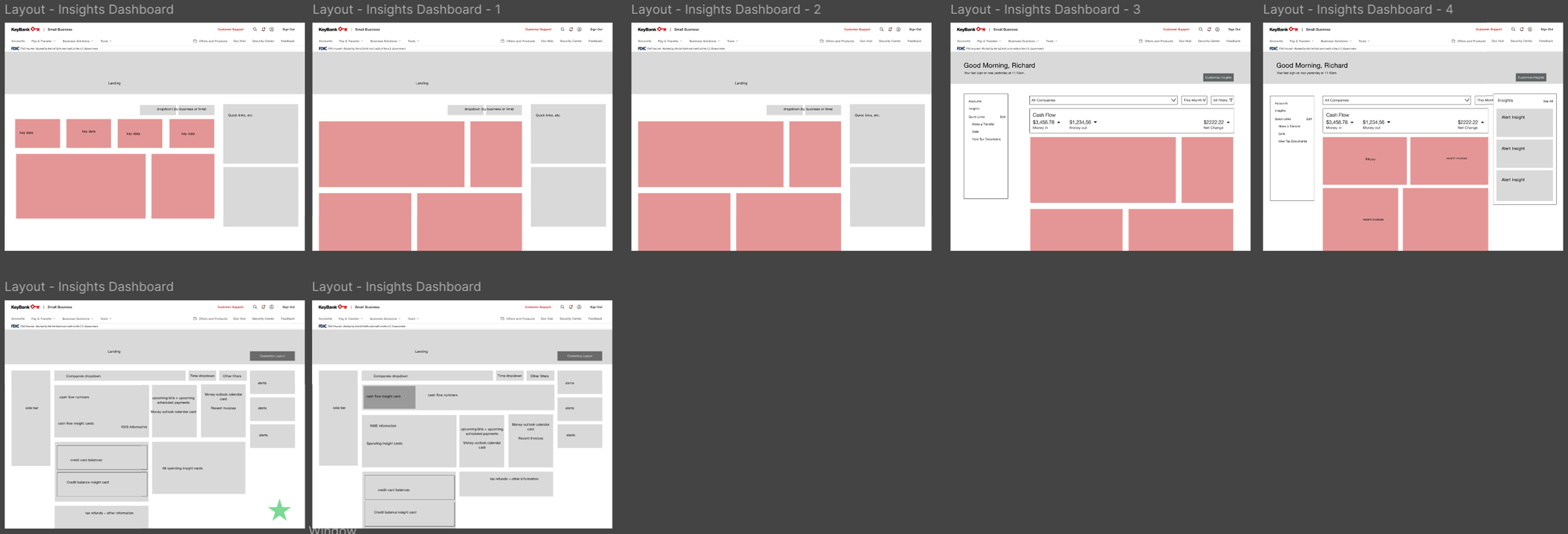
KeyBank insights dashboard low-fidelity iterations

Insights – Peronetics Card Sorting + First Hi-Fi Iteration

Because the business-specific Personetics cards were not yet available, we sorted through retail consumer-facing Personetics cards, selecting the ones that would be relevant for business owners, and sorted them into 4 different categories, along with a dream-state selection of cards.
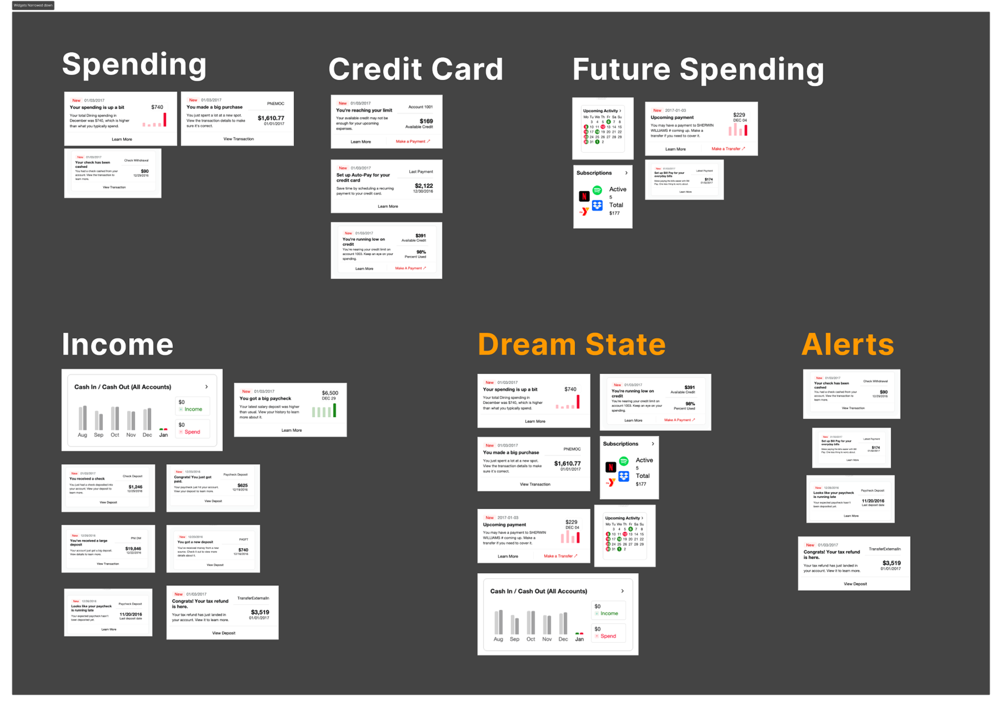
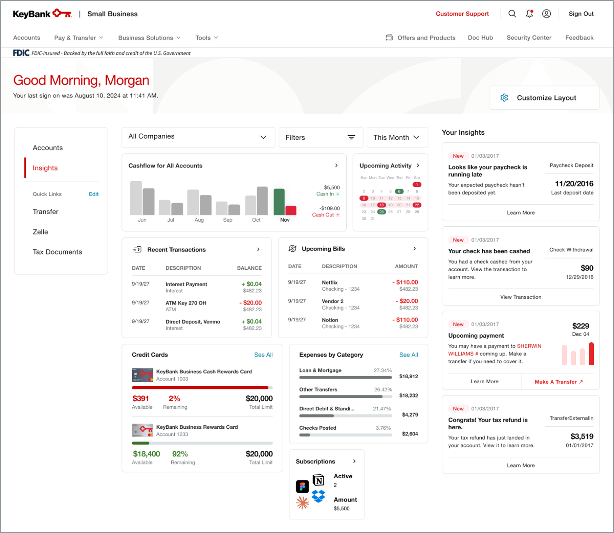
KeyBank Personetics card sortingKeyBank insights first high-fidelity iteration

Insights – Hi-Fi Iterations

KeyBank insights high-fidelity iterationKeyBank insights layout customization iteration

Usability Tests

Overview

Prototype testing helped us understand how users engage with the Account Summary and Insights Dashboard.

Unmoderated

Test Type

19

Participants

UserTesting

Platform

4

Comprehension Tasks

Screen & Audio

Recording Methods

4

Usability/Navigation Tasks

Goals

  • Are users able to navigate and find insight data points?
  • Can users easily understand the information and data visuals presented?

Quotes

Is there anything else you’d like to share about your experience using this dashboard?

  • “Overall it is highly productive and I could see myself using it often. It is organized and valuable.”

What other insight cards would you have liked to see on the dashboard?

  • “Recommendations... it might notice my activity and give me advice (use the extra income from this month to pay off your credit card bill or replace this subscription with this one).”

Results

  • 95% of users easily navigated to and understood the purpose of the insights tab
  • 63.2% of users thought Recent Transactions and Cashflow were the most valuable widgets
  • 4.29 SUPRQ score (89th percentile), a set of standardized questions that measure users’ perceptions including usability, trust, credibility, appearance, and loyalty
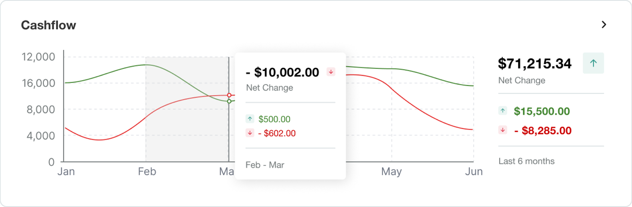
  • 89.47% of users had difficulty understanding cashflow widget
  • 20% of users suggested alerts/notifications on account activity, even though we have insight alerts

Usability Test
Takeaways

Takeaways Overview

  • Emphasize the purpose of the “Your Insights” section
  • Improve the Cashflow Widget layout and terminology to be more intuitive

“Your Insights” Wording Follow-Up Research

Goal

Improve clarity around the wording for the “Your Insights” section, where users can find updates on their recent activity.

We tested three headlines – “Recent Insights,” “Latest Alerts,” and “Key Takeaways.”

Unmoderated

Test Type

31

Participants

UserZoom

Platform

Click Test

Recording Methods

70% of users correctly identified “Recent Insights” as the headline for the section, which was higher than any other headline.
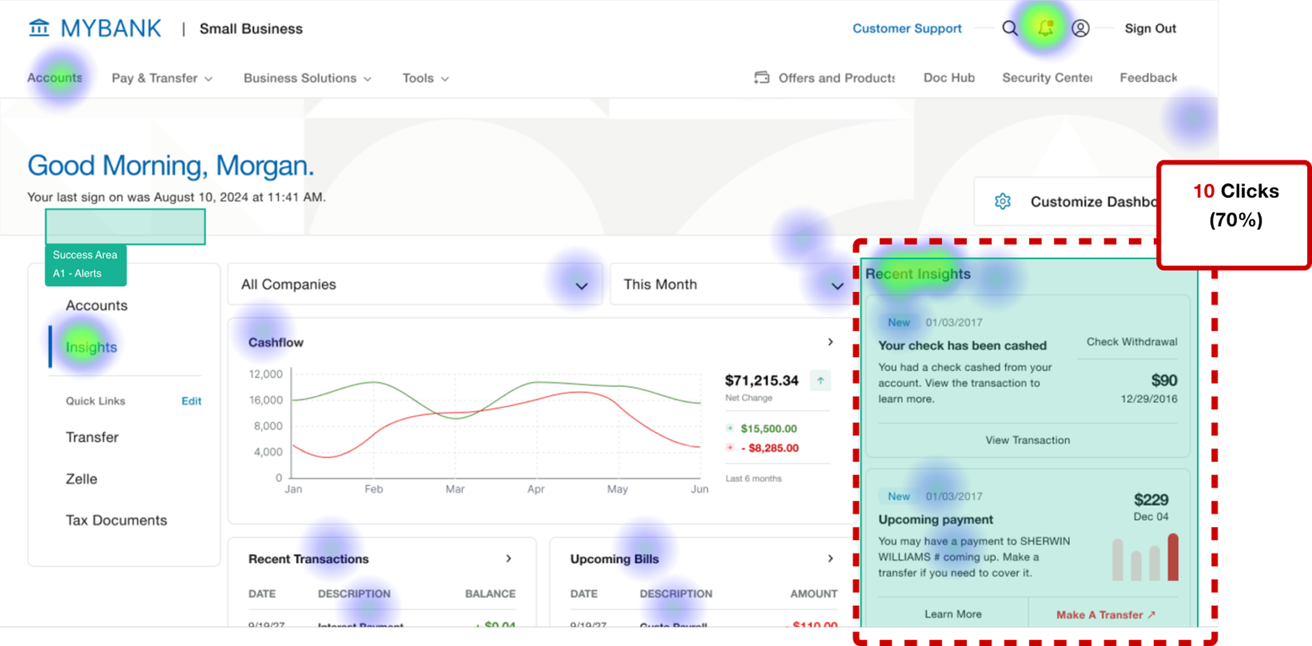
UserZoom heat map for the KeyBank insights dashboard

What would you expect to find under the headline "Recent Insights"?

  • “I would expect recent insights to show timely updates and useful observations about my business account such as unusual transactions, upcoming payments, cash flow changes, delayed deposits, large expenses, and other activity that may need my attention.”

Cashflow Data Interpretation Refinement

Before

Cashflow widget before data interpretation refinements

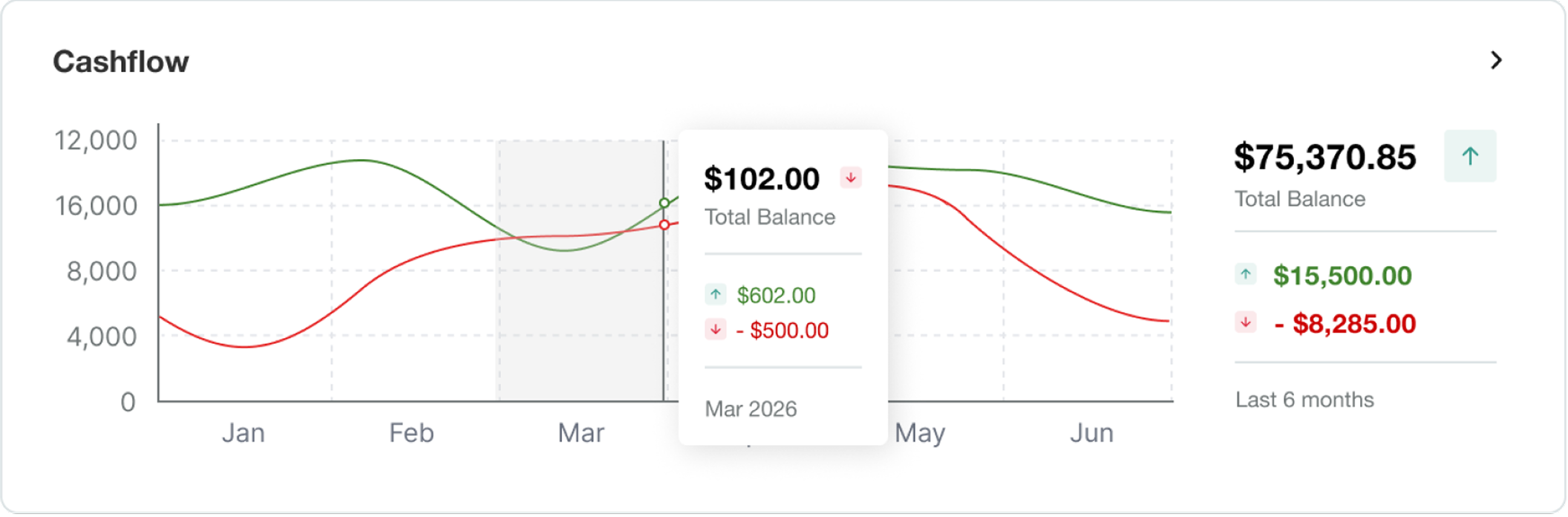
After

Cashflow widget after data interpretation refinements

Goal

Improve the Cashflow Widget layout and terminology to be more intuitive.
Key Adjustments

  • Month labels on the x-axis were moved under their corresponding columns instead of the vertical lines.
  • Label within hover state allowing users to view a specific month was changed from “Feb-Mar” formatting to “Mar 2026”.
  • Cash flow overview to the right was updated from “Net Change” to “Total Balance”

Final Designs

Account Summary

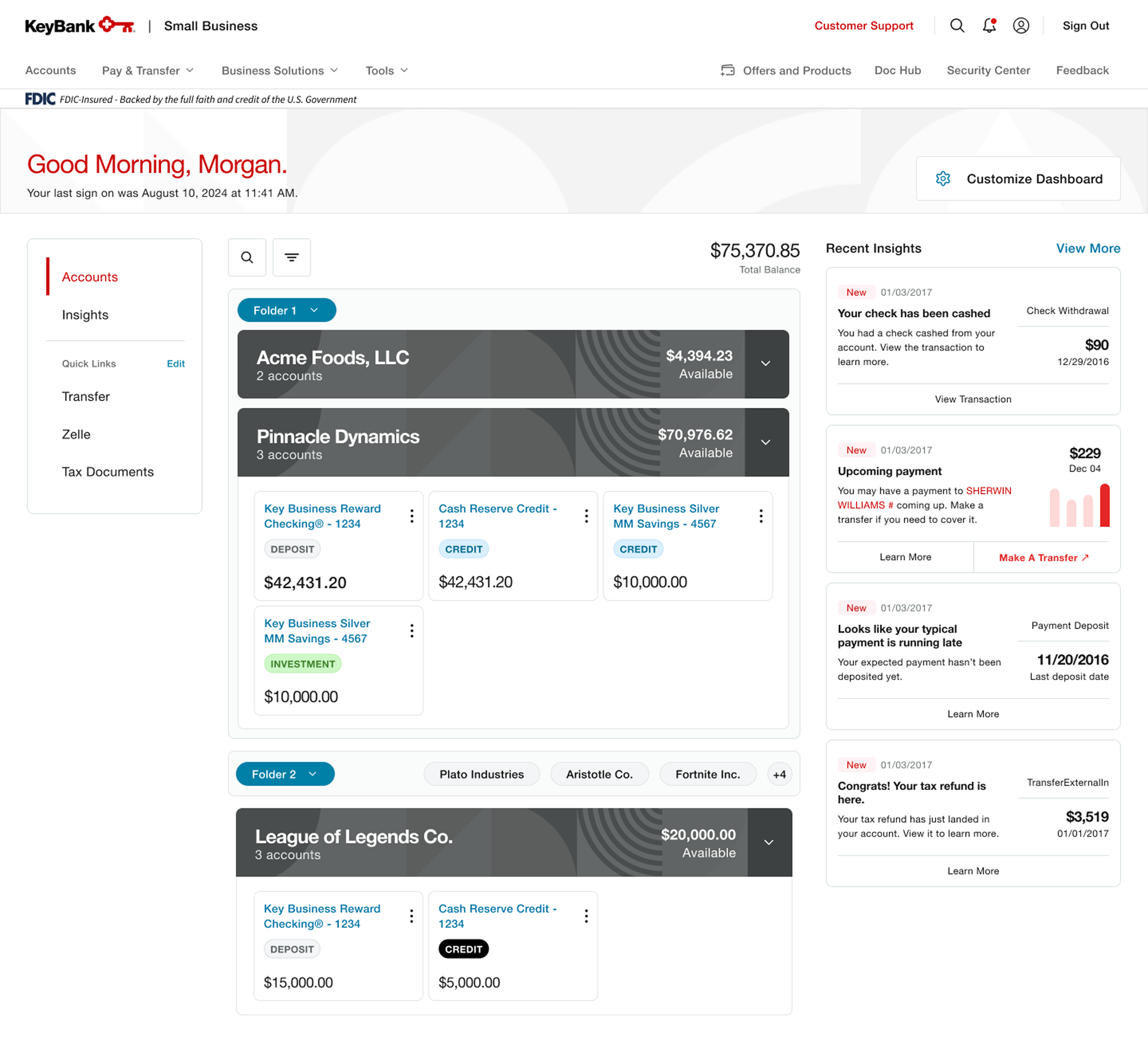
Final KeyBank account summary design

Account Summary - Customize Dashboard View

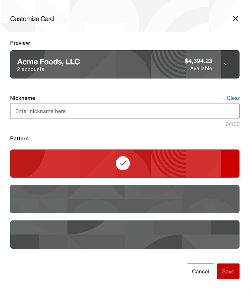
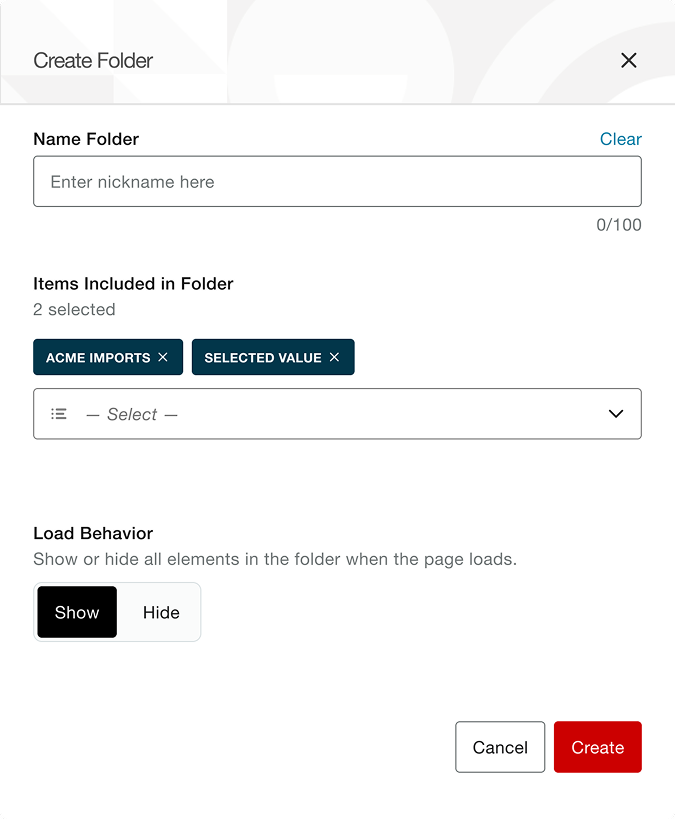
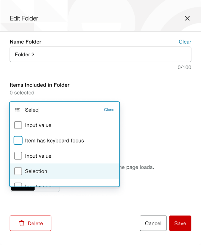
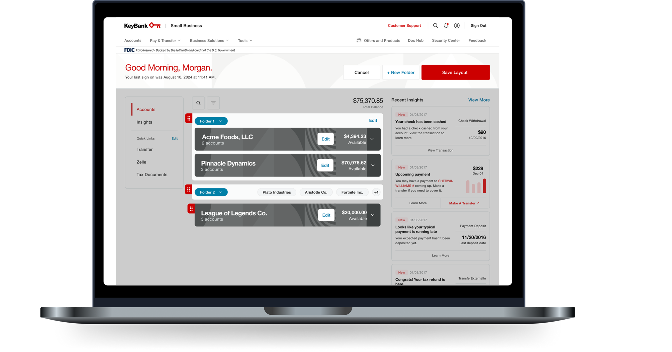
Final KeyBank account summary customization dashboard view

Insights Dashboard

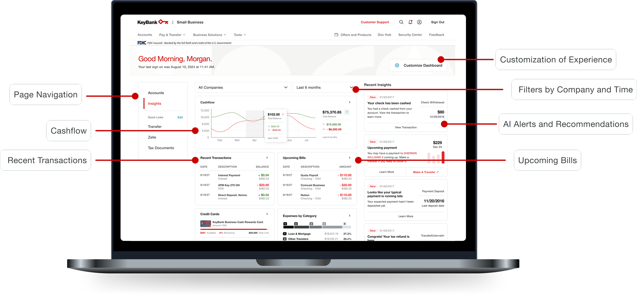
Final KeyBank insights dashboard design

Insights Dashboard - Continued

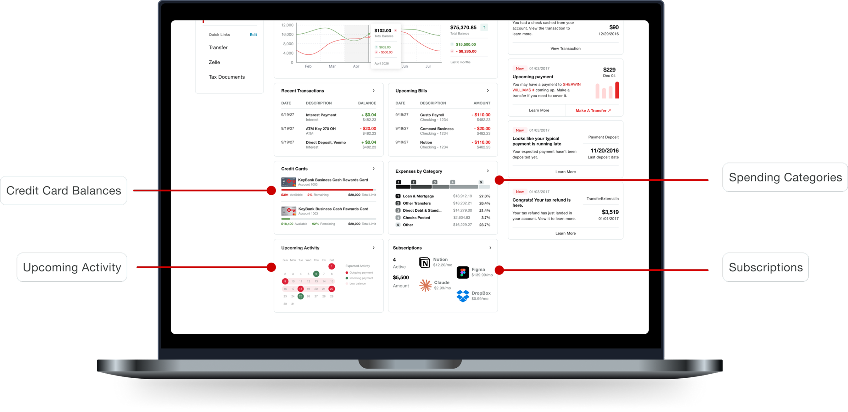
Continued final KeyBank insights dashboard design

Conclusion

Reflection

Although I’ve done design work in the context of professional clubs, freelancing, and other areas, this was one of the first projects I’d completed end-to-end in a corporate setting. It’s an example of how a myriad of different teams, including UX writing, UX research, compliance, and product owners approach a singular product together and influence the end-user’s experience.

As a more complex financial dashboard, it was challenging simplifying all of the necessary information into an easily digestible format. There were many instances in which we had to take into consideration so many different problems, such as how to allow for free customization of the dashboard and knowing how large each widget needed to be.

Next Steps

  1. Since the cashflow widget initially showed low task performance, we would retest that widget to determine if it was intuitive after the new changes.
  2. Once the Personetics business-specific widgets would be released, we would work on reiterating through the designs with those constraints in mind, adhering to the general design and format to maintain usability.
  3. Mobile